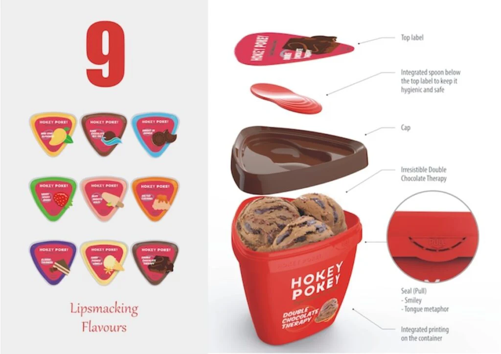
Ice-cream feast for the young
Hokey Pokey is a young startup ice cream company that offers ridiculously good rich & creamy ice-cream targeted at the young audience. We worked with the company to create a packaging that can stand out, breakaway from the conventional round mundane containers. Result of this six month long project was a bright three sided packaging. All flavours have unique colour coding to bring in fun, brightness & cheer.
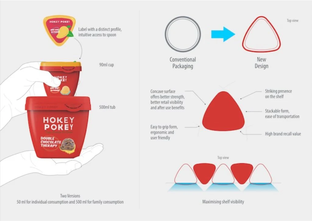
A striking visual language now serves as an identifier for the brand. Our attempt was to break away from the convention with a bold new triangular form. A three sided triangular form is new for the ice cream category
The packaging was designed for reusability & extended life. Consumers are encouraged not to throw the package after use. We observe people using it for all kinds of uses ranging as a storage container to using it as a pot for gardening. We believe that the original idea of making the brand make an early connect with the consumers & have a strong recall value has been achieved by the striking new form that places Hokey Pokey as a premium quirky brand.
“Hokey Pokey as a brand is recognised today by its packaging, one of the first triggers consumers have when they hear Hokey Pokey is the striking triangular shape with its unique color. Sales went up 30% on a m2m basis post launch” Rohan Mirchandani, CEO, DrumsFood.
The original idea of making the brand make an early connect with the consumers and have a recall value has been achieved by the striking new form that places Hokey Pokey as a premium quirky brand. It is priced relatively higher as the ice cream is rich and creamy. Coupled with a retail and strong online presence the packaging has become the central communication theme of the brand.
Hokey Pokey as a brand got recognised today by its packaging, one of the first triggers consumers have when they hear Hokey Pokey is the red triangular shape. Consumers are able to identify the brand in retail display from a distance without even seeing the name. It clearly is distinct and breaks through when in the frozen display. Sales went up 30% when we launched the new packaging from a month to month perspective. The proof of the pudding is in
the eating. We urge you to grab a chance and try the icecream. You will love package as much as the ice cream.
This design won the IndiaStar Design award for the year 2017. India Star is a national initiative by Government of India run Indian Institute of Packaging to celebrate the best of packaging design in India. Winning products go on further for AsiaStar and World Star awards. Read More


Start a conversation.
We design products that compete and win. Tell us what you are working on.